Warm vs Cool Light: What the Kelvin Number Means
Understand warm and cool white light, separate colour temperature from brightness, and compare tones against the surfaces in your room.
By Lumière Light Studio Editorial
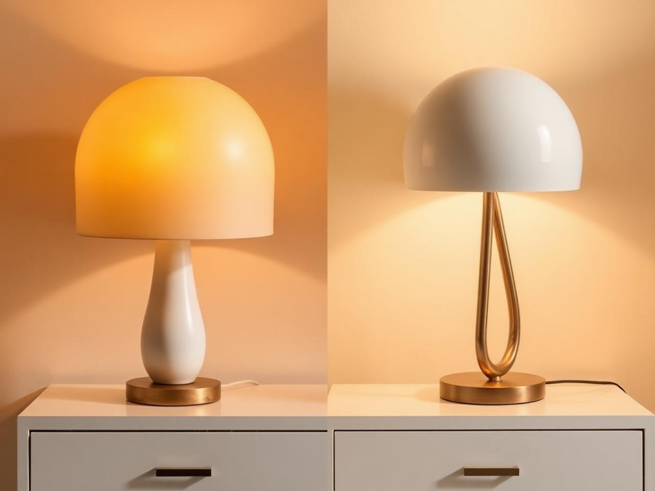
The Kelvin number on a light listing describes its colour temperature, not how much light it produces. A lower number reads warmer and more amber. A higher number reads cooler and bluer. That distinction is useful when two white lights look noticeably different beside each other.
Warm and cool are descriptions of appearance here. They are not claims about the physical temperature of a fitting, the quality of a lamp, or its suitability for every room. Choosing between them begins with the look you prefer and the things you need to see.
Kelvin describes tone rather than brightness
A light described as 2700K generally reads as warm white. At 3000K it still reads warm, with less amber emphasis. A 4000K white usually looks cooler beside either. These are reference points for comparison, not required settings for particular rooms.
Two sources with the same Kelvin value can differ in other visible ways. Their output, shade and direction may be different. The wall behind them may also affect the impression. A Kelvin number cannot tell you whether a lamp will illuminate a desk or whether its bright opening will be visible from a chair.
A warm source can be bright, and a cool source can be dim. Turning a light down is a different adjustment from changing its colour temperature. Some products offer both adjustments, but one does not establish the presence of the other. Read the description of each control separately.
Compare the room’s surfaces, not an abstract ideal
Choose a few familiar references: a painted wall, a cushion and a piece of wood furniture. Look at them under the light you already have. Decide whether the overall cast looks too amber, too cool or close to what you want. This gives a future comparison something concrete to address.
For a surface where colour matters, Kelvin alone does not establish accurate colour rendering. A cooler source is not automatically more accurate, and a warmer one is not automatically more flattering. Avoid using colour temperature as a substitute for information the listing does not provide.
Daylight changes the comparison too. A tone that seems quite warm after dark may appear less prominent beside a bright window. Check the room at the time you intend to use the lamp. There is no need to make the daytime and evening views identical.
Use a short comparison to narrow the choice
- Identify the surface or area the lamp should light, rather than choosing a Kelvin number first.
- Note the tone of the lights likely to be used alongside it. Use published information where available rather than guessing a number from a photograph.
- Decide whether you want the new source to blend into that view or provide a visibly warmer or cooler accent.
- Keep brightness and glare as separate questions. A tone you like may still be in the wrong position or provide too little useful light.
If the product page gives only a word such as warm, treat that as a broad description rather than an exact Kelvin specification. Ask for clarification if a close match matters. Your next step is to record the appearance you want to keep or change, then compare current specifications against that brief.
The Editor's Notes
Get the Lumière styling notes
One quiet essay a month on layering light and shaping the atmosphere of a room. No noise. Unsubscribe anytime.
The Editor's Notes
One essay. One piece. Once a month.
Quiet dispatches from the studio. Unsubscribe anytime.
For the hour after
For the hour after the overhead light goes off
Shop lamps built for the quiet part of the evening.
Share this guide