Mixing Colour Temperatures: When to Match and When to Contrast
Mixed warm and cool light can look deliberate or distracting. Judge the sources that share a view before deciding what needs to match.
By Lumière Light Studio Editorial
A warm table lamp and a cooler ceiling light can make the same wall appear different from one end to the other. That contrast may be welcome, or it may look accidental. The decision is about the room you can see, not a rule that every light in a home must share a number.
Before replacing anything, identify which sources are actually on together. A hallway light glimpsed through a door matters differently from two lamps illuminating the same pale wall. A useful colour-temperature plan follows those visible relationships rather than the boundaries on a floor plan.
Match shared surfaces when you want a quieter view
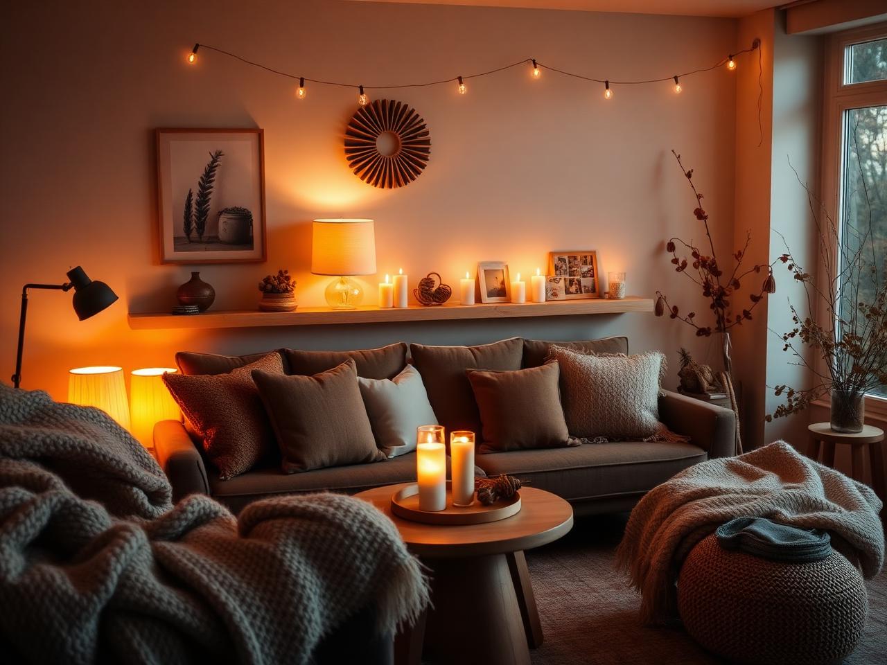
Matching can be a helpful starting point when several lights wash the same wall or sit close together. A continuous painted surface makes differences in tone easy to notice. Similar published colour temperatures may reduce that contrast, though shades and surrounding finishes can still change how the sources look.
Start with the pair that bothers you most. Do not assume every source is wrong because one combination looks awkward. A lamp used alone at another time may already do its job well. A decision based on real use is more precise than replacing lights room by room.
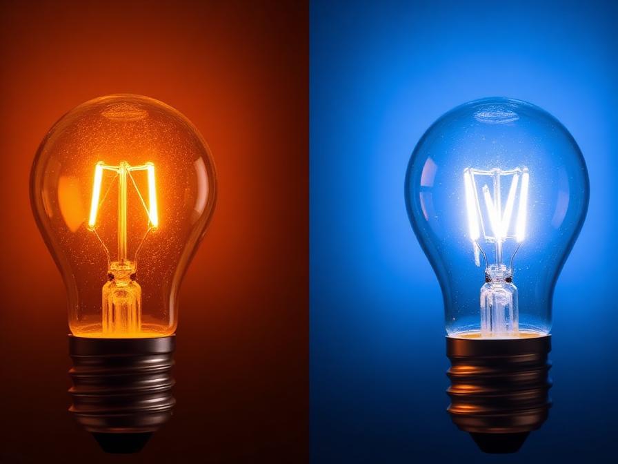
Lower Kelvin values read warmer and more amber; higher values read cooler and bluer. This helps explain a difference between white lights. It does not tell you that one tone is harmful, that another is beneficial, or that your room needs a specific number.
Contrast works better when its role is clear
A warmer accent in a separate corner can look intentional beside a cooler general light. The two sources do not have to compete over the same surface. Separation gives each a visual role, such as highlighting an object or marking a seating area within a larger room.
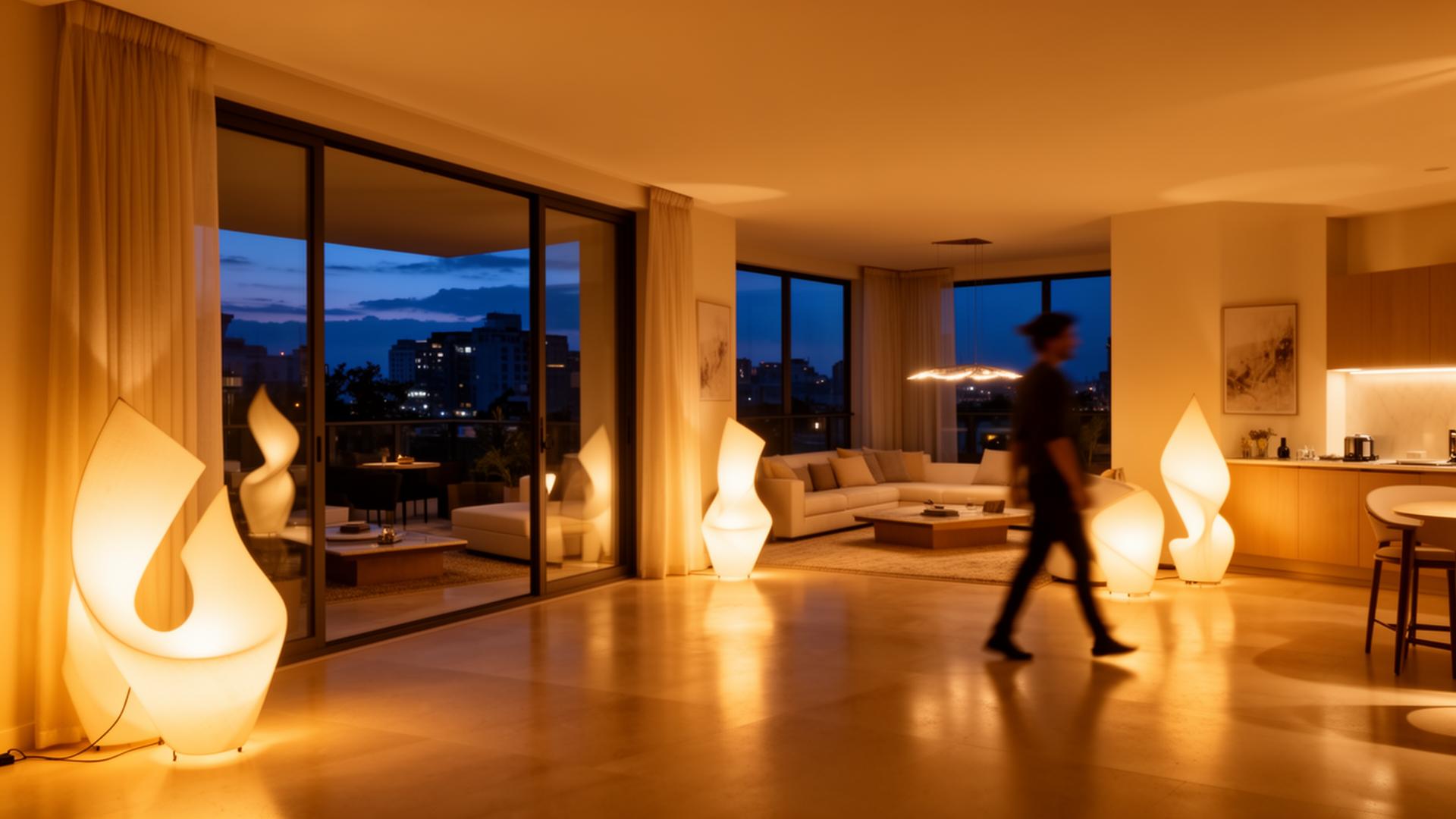
An open-plan space may also have activities that use different lights at different times. A dining area and a work surface need not look identical. Judge the view from the seats people actually use, including sightlines through doorways, rather than seeking a match that exists only on a specification sheet.
Contrast is less convincing when one source creates an unwanted patch of colour on a wall you hoped would look continuous. In that case, compare placement and which lights are on before deciding a new tone is required. Sometimes the troublesome combination is simply not needed.
Make a small map of the lights used together
- List the sources visible from your main seat, including those in adjoining spaces.
- Record their published colour descriptions or Kelvin values if available. Mark missing information as unknown rather than inferring it from a product image.
- Try the normal combinations and note the specific surface where a difference draws attention.
- Decide whether that difference should blend in, remain as an accent, or be absent because the sources serve separate activities.
Brightness is another variable. A bright source can dominate the view even if its tone matches the others. A very visible shade can attract attention for reasons unrelated to colour. Keep these questions separate so a colour change is not asked to solve a placement problem.
Take one shared view as the starting point. Keep a short note of which combination looks best and what still feels unresolved. If a close match remains important, confirm the current specifications before making a change; an unknown Kelvin value is not a promise of agreement.
The Editor's Notes
Get the Lumière styling notes
One quiet essay a month on layering light and shaping the atmosphere of a room. No noise. Unsubscribe anytime.
The Editor's Notes
One essay. One piece. Once a month.
Quiet dispatches from the studio. Unsubscribe anytime.
For the hour after
For the hour after the overhead light goes off
Shop lamps built for the quiet part of the evening.
Share this guide