Orange Glass Lamps: Place a Warm Color Accent Without Overdoing It
Separate the color of the shade from the light it produces, then check an orange or amber accent against the room you already have.
By Lumière Light Studio Editorial
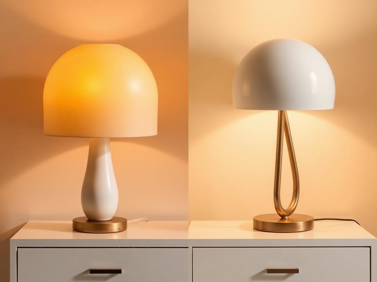
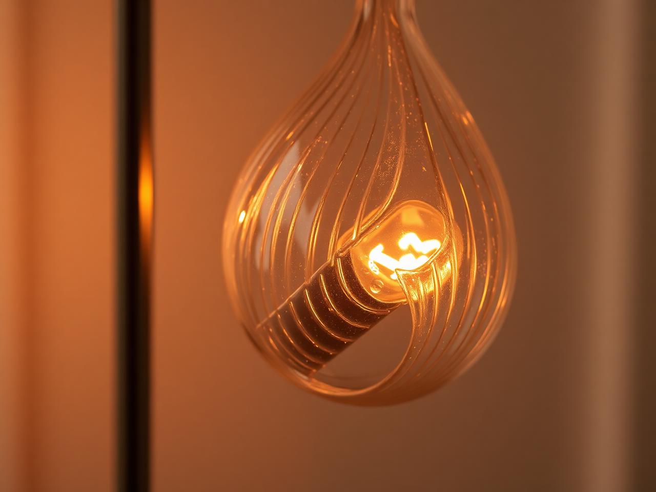
An orange glass lamp can be an appealing object before it is switched on. Its color gives a side table or console a clear accent. That does not tell you how much light it will provide, how far the color will travel, or whether the surrounding room will look the way you imagined. Treat those as separate decisions.
Start by naming what you like: the orange object in daylight, a warm-looking shade in the evening, or a retro-looking silhouette. You may want all three, but choosing the priority makes it easier to compare lamps without expecting a photograph to answer every question.
Judge the shade and the room separately
A colored shade and a warm light source are not the same thing. The shade's appearance alone cannot establish the color or usefulness of the light reaching a nearby chair. Product photography also shows a particular background and exposure, not your room.
Look for an unlit view as well as an illuminated one. Compare the shade against the wall and furniture you have, rather than against the styled setting around it. If the listing does not explain a detail that matters to you, ask before choosing. A color description is not a substitute for current specifications.
Give the orange accent a defined role
Choose a surface where the color can be seen without interrupting its everyday use. On a side table, reserve space for what you actually put down. On a console, leave access to the usual landing place for keys or post. The lamp should not turn an ordinary action into a careful rearrangement.
A single orange accent can be enough. Repeating orange elsewhere is an option, not an obligation. If the lamp already stands out against a plain wall, adding matching ornaments may make the grouping feel more deliberate than you want. Try the lamp alone before deciding that it needs company.
Compare nearby colors rather than following a fixed palette
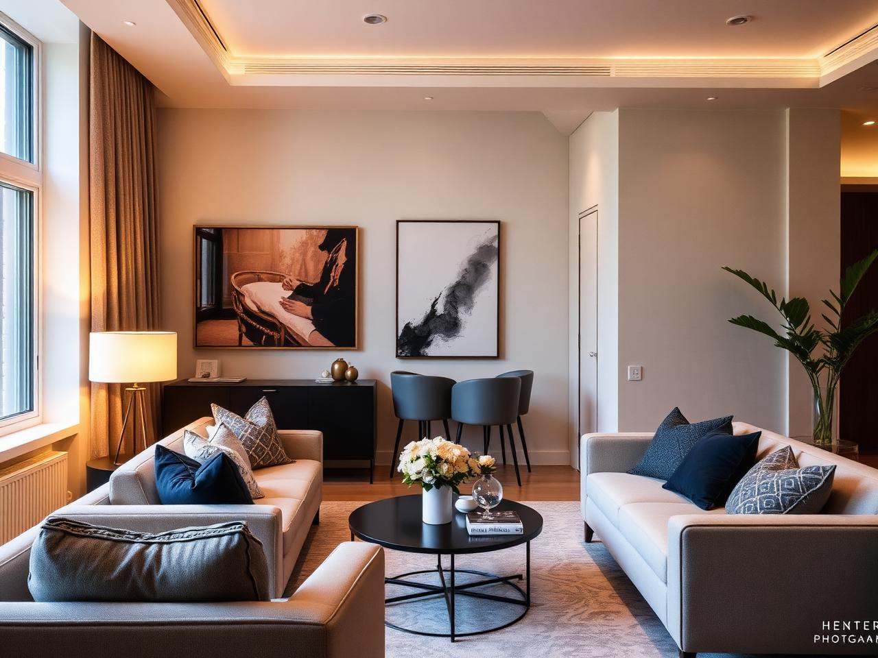
Orange can sit beside wood, pale upholstery, blue paint, or gray furniture. The question is whether you like the relationship in this particular room. A contrasting background makes the accent more conspicuous; a similar-toned background can make it feel more connected to the furniture.
Use a fabric sample or an existing orange object as an early palette check. This previews a color relationship, not the behavior of illuminated glass. Inspect the actual lamp in ordinary daylight and with your usual evening lights when possible. Avoid assuming that a warm-toned setting requires every light source to look orange.
Keep atmosphere separate from practical illumination
A decorative accent does not establish whether a page, work surface, or walking route is adequately lit. Keep the lighting needed for those uses and judge the colored lamp as an addition. There is no need to remove a useful source simply because it looks less distinctive.
Before making a choice, clear the intended surface and note the space available for the base and shade. Then compare current product information with that space. The useful next step is finding a color and form you enjoy in the room, not predicting how long a retro look will remain fashionable.
The pieces referenced above. Check current specifications, delivery and return details on each product page before ordering.
The Editor's Notes
Get the Lumière styling notes
One quiet essay a month on layering light and shaping the atmosphere of a room. No noise. Unsubscribe anytime.
The Editor's Notes
One essay. One piece. Once a month.
Quiet dispatches from the studio. Unsubscribe anytime.
For the hour after
For the hour after the overhead light goes off
Shop lamps built for the quiet part of the evening.
Share this guide