Red Glass Beside Wood: Compare the Actual Finish
Judge red glass against the wood finish in front of you, rather than assuming that a species name predicts the combination.
By Lumière Light Studio Editorial
Two wood cabinets with the same description can look quite different beside a red accent. One may have a pale, quiet finish; another may appear golden, reddish, or very dark. Choosing a lamp by a broad wood label misses the surface you will actually see beneath it.
For this pairing, keep the question narrow: do you like this red glass beside this finished piece of furniture? You do not need a new room palette to answer it. A comparison of the actual colors, pattern, and reflections will be more useful than a rule about which woods belong with red.
Read the finish before naming the wood
Look at the furniture in ordinary daylight. Notice whether its color appears relatively pale or dark, and whether red, yellow, or gray notes stand out to you. These are observations of your piece, not reliable identifications of its species or treatment.
Then look at the grain. A broad, visible pattern may already give the tabletop a strong visual role. A quiet finish may leave more attention available for the lamp. Neither requires a particular choice, but knowing which feature dominates will help you compare two lamps without confusing color with pattern.
Compare three relationships separately
| Relationship | What to look at | Possible decision |
|---|---|---|
| Color | Whether the red stands apart from or blends with the finish | Choose contrast or closeness deliberately |
| Pattern | Whether the wood grain competes with the lamp outline | Reduce other objects before changing the lamp |
| Reflection | Whether the actual tabletop shows a distracting reflected view | Compare another position on the same furniture |
The table is a way to organize observations, not a prediction of how every finish behaves. A surface that looks glossy in a listing may appear different in your room. Inspect the actual view rather than inferring it from a material name.
Keep the comparison consistent
Place a red object or color sample beside the wood as an early check. Keep other colorful objects out of the immediate comparison. Look at the same pairing from the doorway and the nearby seat. A close view can make grain seem more prominent than it does across the room.
If taking photos, include both the furniture and the accent in the same frame. Separate listing images are difficult to compare because their lighting and presentation differ. A photo is a reminder of a relationship, not a precise color record. Return to the objects themselves before settling the choice.
Recheck the pair with evening lighting
The combination should also suit the way you use the room after daylight fades. Observe the lamp unlit and lit if possible, with the normal room lights in use. Do not assume that red glass will make the furniture look richer, or that a reddish finish must clash with it.
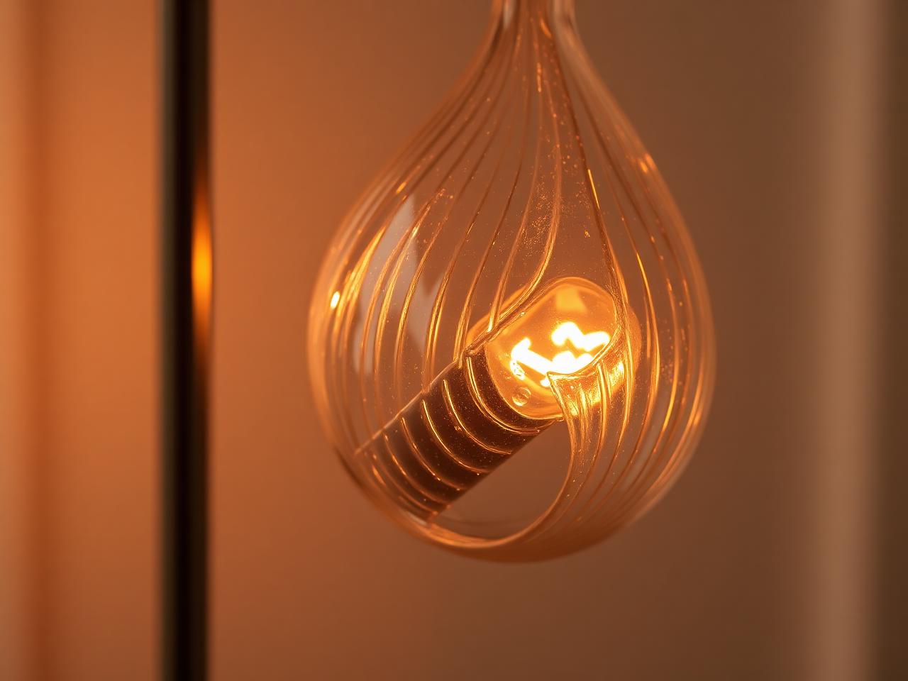
For a concrete styling reference, Prism has a red glass dome shade, a chrome tripod-style base, and warm light. For Prism, check the current specifications on the product page. Start with a comparison beside the actual furniture; let your preference for that specific pairing settle the color question.
The Editor's Notes
Get the Lumière styling notes
One quiet essay a month on layering light and shaping the atmosphere of a room. No noise. Unsubscribe anytime.
The Editor's Notes
One essay. One piece. Once a month.
Quiet dispatches from the studio. Unsubscribe anytime.
For the hour after
For the hour after the overhead light goes off
Shop lamps built for the quiet part of the evening.
Share this guide